Friday, 18 December 2015

Front Cover Drafts

First draft


Second Draft

Third Draft

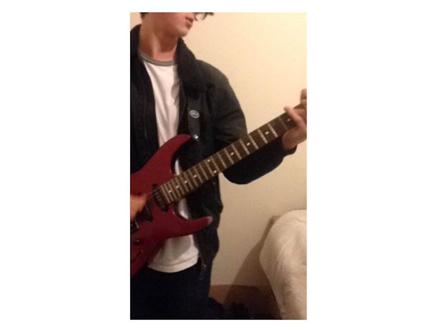
Throughout the process of designing my front cover, I made plenty of changes. Some of these changes included the title as I decided it needed to be thicker as a bold title is a main convention of a magazine. The most obvious change I have made is the cover image. I decided to change this completely as the title ran across the models head, this could not have been used as the image would have been useless. Changing the image completely is a disadvantage as the first image included a musical instrument which is the iconography of my magazine. Instead, the model for my final outcome is portrayed as a singer by his indie clothing. I have also added images of the previous model holding a guitar to assure the audience that this is a music magazine. I improved my magazine by adding more cover stories. This made my magazine look more packed with stories and interviews for the audience.


I chose to take plenty of images for my cover image so that I could experiment as the model is changing positions. This was a great idea as i was able to learn which position suited best for an indie magazine. The clothing the model was wearing were perfect for an indie magazine as his shoes represent his youth which connects him to my teenage target audience. The coat he is wearing fits in the indie criteria as the bagginess gives him a careless/rebel look.   


Wednesday, 16 December 2015

Framing Shots Including And Excluding Elements As Appropriate

This is a close up image for my magazine front cover. The close up is of an electric guitar to show the audience my magazine is a music magazine as a musical instrument is iconographic to music.

 This is an example of an image with bad lighting. This is bad lighting because the image is very dark and will not likely to be noticed by the audience as much as a bright image which would stand out. The dark colours in this image are dark representing many negatives therefore this lighting is not recommended for a magazine front cover because it will not grab the audience's attention.
This image is an example of a badly framed image. This is because the model or prop is not clear or noticeable as we can only see parts of them. This would be a bad image to have as a front cover because the audience may not know what genre the magazine is. The image is also not interesting as there is no full central object/model to focus on. The audience may dislike this image causing them to ignore the magazine.


The images below could be used for my magazine as they have great potential. This is because the guitars show that the magazine is associated with music. The shots I have used are mainly medium shots. This is because many music magazines are a medium shot of an artist. The clothing the model is wearing also relates to the indie theme as he creates a casual look. I have found many images of indie clothing with casual looks like this. His messy hair look represents his independence (hence 'indie'). I have yet to manipulate these images by changing many things such as the lighting, the background and the colours. I am going to do this to fit my audience's needs.


Thursday, 26 November 2015

18th December Deadline Plan

Google Mock Ups   - Using images that aren't mine. (To do before original photographs) *COMPLETE BY DECEMBER 3RD*
Front Cover
Contents Page
Double Page Spread

Original Photography - Images taken by me.
*COMPLETE BY DECEMBER 9TH*

Placing The Photos Onto Your Front Cover
*COMPLETE BY DECEMBER 9TH - 11TH*

DECEMBER 18TH - FRONT COVER FINISHED

Thursday, 1 October 2015

Google Mock Up Ideas

Using existing images from the internet, use Photoshop to create
1x mock up of a front cover,
1x contents page
1x double page spread.


Contents Page House Styles

Look at 3 contents pages from the same magazine (different issues) and explain how images and text (fonts, and sizes) are used to create a ‘convention/house style’ for that product

Colour Scheme Ideas, Name Ideas And Feature Story Ideas

-Choose a variety of name ideas (at least 12) for you magazine and explain your choices. State what your final choice is for the name of your magazine and the reasons for this.


Colour Scheme


I have used colours such as black and white as I found that they are used for the title of almost every indie logo, for example; the images below. I liked the idea of pink and grey as 66% of my audience are female and pink is stereotypically a girl's favourite colour. I have decided to use the top right colour scheme as yellow is not categorized as a certain gender colour.

Feature Story Ideas


''10 New Faces Of 2015''
This will grab the audience's attention as a list of new Indie singers will be specified. My target audience would like this as my reader profile research shows that 91.67% listen to music every day. This shows they would be willing to seek new singers to listen to.

''Catfish And The Bottlemen On Tour''
This feature cover story will fit with my target audience as Catfish And The Bottlemen are an Indie Rock band. This story will appear on the front cover of my magazine gripping people's attention as they would like to know more about this tour. They would purchase this magazine to read more.

''Unseen photos!''
This feature story idea is teasing the audience as they now know that this magazine contains unseen images. This will grab their attention as they feel like they need to see these images. They will purchase the magazine to find out more which is why this feature story idea is successful. 

Name Ideas

I have used my reader profile research as a stepping stone for the name ideas for my music magazine to suit my target audience. 

''Arabella''
Arabella; Latin for 'yielding to prayer' also meaning beautiful, lovable, graceful, is a name of a song by Arctic Monkeys; an indie band my target audience listen to. This also fits with my target audience as 66.67% are female. Arabella is a great choice for my magazine name as it does not only include a ladylike meaning, (beautiful,) it relates to a famous indie band. 

''Independent''
Independent is a good choice for my magazine name as my theme (indie) is a shorter word for independent. It also suits my target audience as 75.00% listen to music through their mobile phone showing they have their independent playlists. 0.00% listen to music dependently through the radio.

''Daily''
''Daily'' suits my target audience as 91.67% listen to music every day. Although I do not think this name idea is as effective as it is a dull and boring name. 

''1''
Using a number for my magazine creates a unique effect which would grab people's attention. 1 could mean the 1'st best magazine around.


Double Page Spread House Styles

Look at 3 double page spreads from the same magazine (different issues) and explain how images and text (fonts and sizes) are used to create a house style.


Branding Logo Design


Serif 

Examples of font: Times New Roman - Traditional
Magazine example: Q
Use of typeface: Body, Display
Connotation: Traditional, Established 
Genre: Classical, Jazz

Sans Serif

Examples of font: Areal

Magazine example: NME

Use of typeface: Body, Display

Connotation: Modern, Fresh, Clean

Genre: Indie Rock

Block Serif


Examples of font: Rockwell

Use of typeface: Headline, Display

Connotation: Modern

Genre: Pop Punk, Rap

Decorative


Examples of font: Chiller

Magazine example: Kerrang

Use of typeface: Display

Genre: Rock

Script

Examples of font: Harrington

Use of typeface: Display
Connotation: Bold, Regular, Italic
Genre: Classical, Indie

Websites Used For Fonts: 1001fonts.com // dafont.com


I have used colours such as black and white as I found that they are used for the title of almost every indie logo. Examples shown underneath.


Mise-En-Scene location And Prop Ideas


As a prop for my cover image I am going to use a guitar. I have yet to decide whether I would like an acoustic guitar or an electric guitar. During research I found that electric guitars are used for more indie rock which will fit with my audience perfectly as 6/12 people from my reader profile research listen to rock/ indie rock music.

Costume Designs

Create 3 costume looks for your artist that really demonstrates the genre of your magazine. Explain why you have chosen these outfits and explain why it will appeal to your target audience.


Style/ Iconography Of My Product

-Create a video/mood board/sketches of the style your magazine will take. Look on pintrest to gather ideas related to the genre/style of your genre and some stylistic elements you want to create.  E.g.
-Images you like the style of
-Album work of existing artists
-Existing front magazines you find inspirational/like the style of.
-Imagery you find interesting
-Posters/ artwork from existing bands in your genre.
-Themes you think your audience would be interested in etc.


The images above are iconographic to the theme indie. 


For the font of my magazine name, I am looking to find formal font. Although an immature font such as graffiti expresses the meaning of indie/independent, I like how fonts such as Times New Roman represent the magazine seriously. The formal font is traditional and old fashioned.This links to the theme indie as the iconography would be a vinyl record which is also old fashioned. 


My Reader Profile