This is a close up image for my magazine front cover. The close up is of an electric guitar to show the audience my magazine is a music magazine as a musical instrument is iconographic to music.
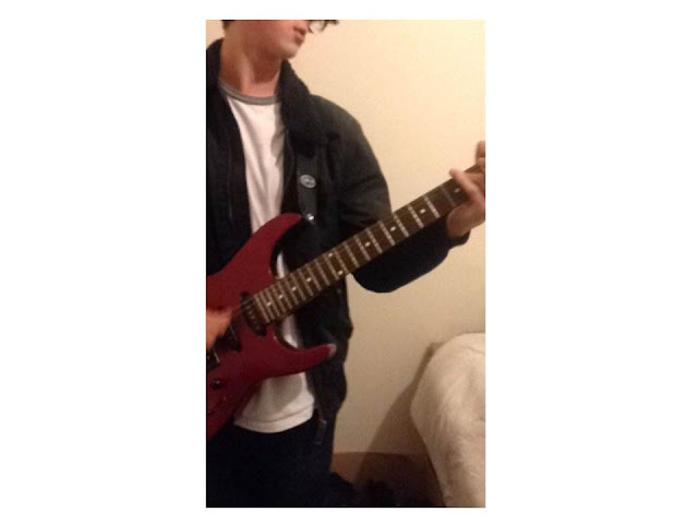
This is an example of an image with bad lighting. This is bad lighting because the image is very dark and will not likely to be noticed by the audience as much as a bright image which would stand out. The dark colours in this image are dark representing many negatives therefore this lighting is not recommended for a magazine front cover because it will not grab the audience's attention.
This image is an example of a badly framed image. This is because the model or prop is not clear or noticeable as we can only see parts of them. This would be a bad image to have as a front cover because the audience may not know what genre the magazine is. The image is also not interesting as there is no full central object/model to focus on. The audience may dislike this image causing them to ignore the magazine.
The images below could be used for my magazine as they have great potential. This is because the guitars show that the magazine is associated with music. The shots I have used are mainly medium shots. This is because many music magazines are a medium shot of an artist. The clothing the model is wearing also relates to the indie theme as he creates a casual look. I have found many images of indie clothing with casual looks like this. His messy hair look represents his independence (hence 'indie'). I have yet to manipulate these images by changing many things such as the lighting, the background and the colours. I am going to do this to fit my audience's needs.


No comments:
Post a Comment