Thursday, 25 February 2016

1) In What Ways Does Your Media Product Use, Develop Or Challenge Forms And Conventions Of Real Media Products?

Existing Magazine Cover
My Magazine Cover

Masthead

My masthead follows the conventions of existing indie music magazines such as NME. This is because they tend to use bright colours hence I used the colour white for my masthead. The colour of this convention is very important as it is the first thing to catch people's attention as the magazine sits on the shelf. The font is usually bold for a indie magazine, I noticed this as I researched existing products. Luckily I did this as my masthead started off as a thin font which was hardly noticeable, this wouldn't have been successful as it was not following the conventions of existing products. I was able to change this through PhotoShop to create a bold font which stands out. The capitalisation of the font used represents maturity which also enables the audience to read the masthead without confusion. Many indie magazines vary on their masthead capitalisation as some are fully capitalised whereas some are lower case. I decided using my audience research that I did not want a font too childish for my magazine. 

Main Image

My main image follows the conventions of existing indie music magazines as I have used one person to fill the full page. I had found through research that existing indie magazines had used a medium close up as their main image. I had developed from this as I had taken many images which were potential main images, I had used a variety of shots to close ups to long shots. As a result I decided to go independently and use a long shot as my main image. Overall this was a great idea as the model was able to use the body language I demanded. The model's body language shows confidence which fits perfectly with the 'indie' (independent) genre. The models used for existing magazines are showing their true colours as they may be wearing unusual clothing or using rare body language which I have worked from. The model used is perfect for my target audience as he can be seen as a teen heart-throb as he fits with the age range of my audience. 

Plug 

My plug is used to give the audience a change to win a competition. This challenges other existing products as not many indie magazines use plugs for this manner. I have designed the plug to be bright yellow causing it to stand out from the page. I used PhotoShop to manipulate the image to create a border forcing it to stand out. It also catches the audience's attention as I have written the word 'win' and 'tickets' in bold which will increase the interest in my magazine. 

Secondary Stories

Secondary stories are regularly placed on the side of the main image so that the reader does not get confused between the secondary stories and the main feature story. The selection of colours I have used follow the conventions of an existing indie product as I have used a bright colour; yellow, to contrast with a dark colour; black.

Feature Cover Story

My feature cover story follows the conventions of an existing magazine as I have used a name in bold. The name usually belongs to the person whom is the main image, which is what I have done. I have used a bright yellow border as bright yellow is within my chosen colour scheme.

Secondary Images

Through research I found that it is rare to see secondary images on an existing indie music magazine as they keep their magazines so simple whereas indie music magazine: NME are a little more complex. This particular magazine uses a secondary image on almost every magazine they publish. I took an interest to this and decided to follow this convention. I took note of the styles they created the secondary images such as the borders around them. The polaroid affect was popular (designing the image to look like a printed polaroid photograph) which inspired me to use this. As not many other indie magazines use this convention; it gave me the chance to challenge them.


Friday, 12 February 2016

Double Page Spread Drafts

Draft 1

Draft 2

Final Product


To improve my double page spread I rearranged the page and changed the choice of image to use as the background. I started with the background image and a secondary image but decided that I didn't particularly like the background image as it didn't give much information about the model which would have linked it to the story. I then experimented by using PhotoShop to expand the secondary image to make it the main image. In my opinion I disliked this idea a lot as the image lost focus and the colours merged with the the colour of the text. To improve this fault I looked for a landscape image such as this one. This worked well as it did not stretch when I edited it. I used PhotoShop to cut out a chair in the background which was overlapping the text. I also spaced out the title so that when the page folds in half; the title is still readable.                                                                  

Friday, 18 December 2015

Front Cover Drafts

First draft


Second Draft

Third Draft

Throughout the process of designing my front cover, I made plenty of changes. Some of these changes included the title as I decided it needed to be thicker as a bold title is a main convention of a magazine. The most obvious change I have made is the cover image. I decided to change this completely as the title ran across the models head, this could not have been used as the image would have been useless. Changing the image completely is a disadvantage as the first image included a musical instrument which is the iconography of my magazine. Instead, the model for my final outcome is portrayed as a singer by his indie clothing. I have also added images of the previous model holding a guitar to assure the audience that this is a music magazine. I improved my magazine by adding more cover stories. This made my magazine look more packed with stories and interviews for the audience.


I chose to take plenty of images for my cover image so that I could experiment as the model is changing positions. This was a great idea as i was able to learn which position suited best for an indie magazine. The clothing the model was wearing were perfect for an indie magazine as his shoes represent his youth which connects him to my teenage target audience. The coat he is wearing fits in the indie criteria as the bagginess gives him a careless/rebel look.   


Wednesday, 16 December 2015

Framing Shots Including And Excluding Elements As Appropriate

This is a close up image for my magazine front cover. The close up is of an electric guitar to show the audience my magazine is a music magazine as a musical instrument is iconographic to music.

 This is an example of an image with bad lighting. This is bad lighting because the image is very dark and will not likely to be noticed by the audience as much as a bright image which would stand out. The dark colours in this image are dark representing many negatives therefore this lighting is not recommended for a magazine front cover because it will not grab the audience's attention.
This image is an example of a badly framed image. This is because the model or prop is not clear or noticeable as we can only see parts of them. This would be a bad image to have as a front cover because the audience may not know what genre the magazine is. The image is also not interesting as there is no full central object/model to focus on. The audience may dislike this image causing them to ignore the magazine.


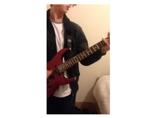
The images below could be used for my magazine as they have great potential. This is because the guitars show that the magazine is associated with music. The shots I have used are mainly medium shots. This is because many music magazines are a medium shot of an artist. The clothing the model is wearing also relates to the indie theme as he creates a casual look. I have found many images of indie clothing with casual looks like this. His messy hair look represents his independence (hence 'indie'). I have yet to manipulate these images by changing many things such as the lighting, the background and the colours. I am going to do this to fit my audience's needs.


Thursday, 26 November 2015

18th December Deadline Plan

Google Mock Ups   - Using images that aren't mine. (To do before original photographs) *COMPLETE BY DECEMBER 3RD*
Front Cover
Contents Page
Double Page Spread

Original Photography - Images taken by me.
*COMPLETE BY DECEMBER 9TH*

Placing The Photos Onto Your Front Cover
*COMPLETE BY DECEMBER 9TH - 11TH*

DECEMBER 18TH - FRONT COVER FINISHED

Thursday, 1 October 2015

Google Mock Up Ideas

Using existing images from the internet, use Photoshop to create
1x mock up of a front cover,
1x contents page
1x double page spread.


Contents Page House Styles

Look at 3 contents pages from the same magazine (different issues) and explain how images and text (fonts, and sizes) are used to create a ‘convention/house style’ for that product